It is hard to begin a review of a watch like this. There is just so much to say, and I don't know where to begin. So many elements of the watch and its history merit discussion - and I can't cover it all. I'll do my best, and am very excited to present to you a hands-on review of a very special watch.
This is the Bulgari (Bvlgari) GG Gefica Hunter GMT Moon Phase watch. It is a limited edition model based on the original Gefica as designed by Gerald Genta under his eponymous brand. The Gefica family began in 1988-1989 I believe, with the release of this piece's ancestor. This more modern Gefica watch case design is at least 10 years old, with a look that has more than endured today. It is extremely unique, but wonderfully well done. A polarizing design no doubt but I find the Gefica to be ultimately appealing as the kind of watch I have lusted after for years.
It all started with Gerald Genta whom I believe claimed that the design of the watch was inspired by a safari trip to Africa. Having recently passed away, Gerald Genta is considered to be one of the last generation's most important watch designers. He is most well known for his creation of the Audemars Piguet Royal Oak and Patek Philippe Nautilus watches. When he began his own brand, his design taste really started to mature.
The Gefica case has a tribal relic appearance unlike anything most people had seen before it was first debuted. While this Bulgari version has a modified dial, the original model (upon which this is based) had an art deco look. Who would have thought to combine tribal and art deco aesthetics? The result was masterful, and the functionality and legibility of the dial, given its novel design, are legendary. I first discussed the Gerald Genta Gefica watches here.
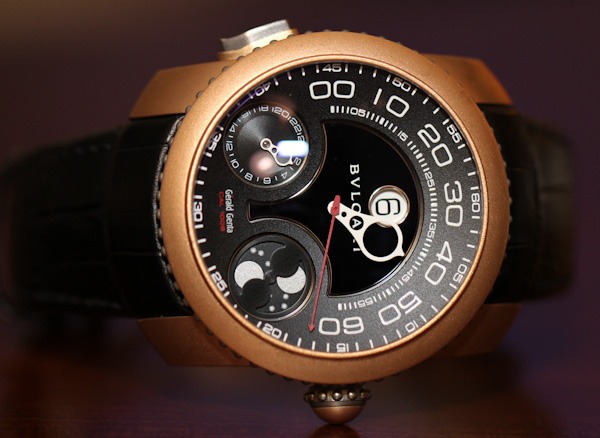
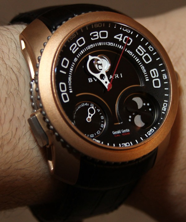
Although I am not sure if it was the first watch to offer a bronze case, it is the seminal one in my memory. Currently bronze watches are in fashion, but at the time, the Gefica's choice of material was almost rebellious. The case is mixed with bronze and titanium elements. While under the Gerald Genta brand, it was released in a few color styles and was renowned not only for the case design, but also the dial. As I mentioned, the original art deco aesthetic of the dial combined a jumping hour display with a retrograde minutes hand, and the date. The limited edition model I reviewed removed the lower retrograde date display and replaced it with a GMT hand and moon phase indicator. The beauty and ergonomic simplicity of the hour and minute indicator is unmatched elsewhere.


So how did this Gerald Genta watch get a Bulgari name on it? Bulgari owned Gerald Genta for many years and in 2008 when the economy crashed they made an interesting decision. In order to control costs, the Bulgari brand would engulf Daniel Roth and Gerald Genta. This would save the watch models and reduce operating expenses. The best Daniel Roth and Gerald Genta watches would remain with slightly revised designs done in order to incorporate some Bulgari DNA - I first wrote about that here. As of now, the additional of Bulgari DNA mostly means altered dials and model names. On this Gefica model there is still a lot of Gerald Genta branding if you look closely.
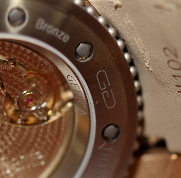
On the dial you have shared Bulgari and Gerald Genta branding. According to Bulgari, watches like this are under the "Gerald Genta aesthetic collection." My suspicion is that in a few years, the Gerald Genta branding will be phased out on the Gefica and other models. Not that I don't want Bulgari to honor the origins of these watches, but to new consumers the multiple branding is no doubt going to be confusing at best. For instance, Bulgari's name is engraved in the titanium buckle, but "Gerald Genta" is still lightly engraved on the automatic rotor on the movement. For the time being you can still enjoy branding elements of both worlds.
The major change to the Gefica collection under the new Bulgari branding are the dials. The new dials are shaped the same, but have some color and design differences. The new ones are slightly more subtle, with darker dues and more of an Italian feel to them. The art deco aesthetic ghost is still there, but not quite like the original. Having polled several people, I have found that some prefer the original Gerald Genta look, and some prefer the cleaner Bulgari look. For me they are both nice in their own way - and this model specifically is unique to Bulgari with no older GG analog.


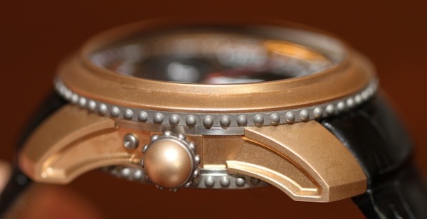
The design of the Gefica case is pretty amazing. Like I said, not everyone will like it, but there is a lot to appreciate. First, why bronze? Bronze is actually a pretty piss poor case material for most watches. This is because bronze ages very quickly and oxidizes. This means everything from extreme discoloration to the growth of green chips on the surface of the case. As you'll notice, the caseback of the watch is titanium. This is because bronze is not meant to come into contact with your skin for long periods of time. However, for this tribal antique look, bronze makes sense. Genta wanted the case to age over time. His idea was that the wearer would actually use a special kit to "clean" off the watch as it aged. The result would look like something that is old but taken care of. The titanium elements are modern and of course would not corrode at all.
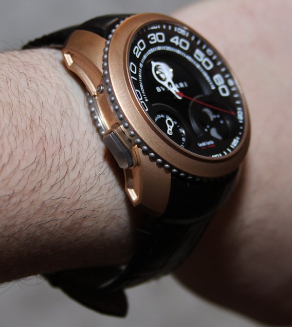
Little titanium balls are all over the case and are inspired by African tribal items. These add a special dimension to the design and have since been copied in other watches. Double rings of beaded titanium are sandwiched on the sides of the case and also on the crown. For its time (and now), the Gefica was a large watch. It is over 19mm thick and about 47mm wide. On the wrist it sits tall, but is very comfortable thanks to the flat bottom and curved lugs. Very much an ergonomic design and the case is water resistant to 100 meters.
The strap is alligator and integrated right to the edge of the case. You basically aren't allowed to be a high-end watch these days if you have too much of a gap between the strap and the case. The strap is structured on the inside to remain shaped near the lugs and flow down to a solid titanium deployant buckle. The buckle is beautiful and extremely well designed to be comfortable and snap
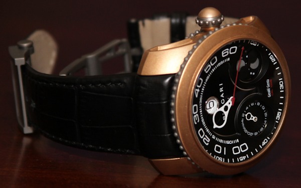
This particular GG Gefica Hunter GMT Moon Phase watch is just that. The movement has the time (jumping hours and retrograde minutes) with a central red seconds hand. The lower dial has a moon phase indicator (one of those open ones that show the moon phase in both hemispheres), and a subsidiary 24 hour GMT hand. The GMT hand is adjusted using the large pusher on the left side of the case. There is an inset pusher to adjust the moon phase indicator.
You can't help but love the clever retrograde minute hand. Getting wider at the top, it is open in order to not block the hour window too much. The size also makes it legible. Reading the time this way is pleasing actually. The mechanism is sensitive, and needs proper care. According to Bulgari you can't adjust it too fast, and I think they recommend only adjusting it in one direction. In order to make setting the watch easier and safer (and to help reset the system if it gets stuck), there is an additional inset pusher that adjusts the hour disc. Over the case is a highly domed sapphire crystal. It does have a lot of AR coating but given the curve, it still reflects light. Nevertheless, the curved crystal is beautiful and offers a lot of legibility to the dial given its clarity.
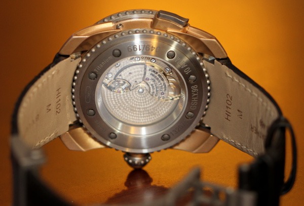
On the back of the watch is a deeply set sapphire caseback window. The movement finishing is unlike anything else I have seen before. Gerald Genta called it a "potter" finishing. I call it "micro perlage" and it covers the entire surface of the movement and the automatic rotor. Most movements have different finishes to highlight the different parts of the mechanism. Here, the viewable areas are pretty much all covered in the same polish. It is a unique look and offers something quite different.
Inside the watch is the Gerald Genta caliber GG 1006 automatic movement. Like most all Gerald Genta watches, the movement is built on a base Girard-Perregaux automatic movement with a Gerald Genta module on top of it. The power reserve is 45 hours, and it is really a fun and useful movement to have in a watch.
Like all legends, it is hard not to want one of these. Owning one will either have you entering a Bulgari boutique or finding one of the other older Gefica watches out there. I for one have had a soft place in my heart for the Gefica collection for years. The deep, functional, beautiful dial is lovely to look at - and the case is a work of art and intrigue unto itself. This is a real emotional watch, and a well-done one at that. The Bulgari GG Gefica Hunter GMT Moon Phase watch is part of a limited edition of just 199 pieces. Each is priced at 18,900 Swiss Francs.