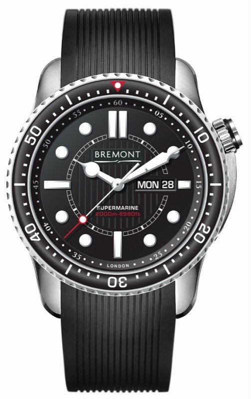
The biggest "cultural" difference between the Bremont Supermarine 500 and the Supermarine 2000 (aka S2000 - no, not like the Honda) is the little text at the bottom of the dial. The Supermarine replaces the old "Swiss Made" with simply "London." Does that mean the S2000 is not Swiss made? No. Instead, it shows that Bremont has come a long way in its ongoing journey to be a serious British luxury brand. It wants people to know that it is English through and through, and will eventually lead to movements made in the UK as opposed to Switzerland.
The Supermarine 500 remains my favorite Bremont watch to-date. You can find a full review of the Bremont Supermarine here. I quite love that watch and the Supermarine 2000 will not really be all that different. The idea for the 2000 is to be a larger, more durable piece. These pictures are pre-renders of the final watch. I have also personally checked out a prototype of the 2000, and confirm it is everything I love about the Supermarine 500, plus about "1500."
Why is the Supermarine 2000 being made? To be honest I don't think it has anything to do with people needing more water resistance. It likely has more to do with Bremont's own motto which is "tested beyond endurance." That brand asserts the durability and robust nature of their watches, and with 500 meters of water resistance, the original Supermarine wasn't able to compete with some alternatives from brands such as Breitling, Rolex, etc... on paper. It is true that your basic "true" diver needs only 300 meters of water resistances, but there is a strange sort of mental assurance that higher water resistance levels provide. Bremont wanted anyone who bothered asking to know that Bremont does indeed have a silly deep going dive watch. Will there be competition between the Supermarine 500 and 2000? Probably, but it will be interesting to see what sales of both are like in a few years.
The case shape is mostly the same but sized up to 45mm wide. The bezel is slightly different (new red arrow), but retains the nice sapphire crystal ring around the SuperLumiNova coated numerals all over. The dial is the same that we love with some red text. According to Bremont, the piece is the same but just larger and with more water resistance. Inside the watch is the same Bremont modified and COSC Chronometer certified base ETA 2836 automatic movement. On the wrist the new size is welcome, but it doesn't take away from my appreciation of the Supermarine 500 that I still love. In a few months we will get more details on the final piece with all the models and pricing.

Tech specs from Bremont:
Movement: Modified calibre 13 1/4” BE-36AE automatic chronometer, 25 jewels, Glucydur balance. Anachron balance spring, Nivaflex 1 mainspring, 28,800 bph, 38-hour power reserve, Bremont moulded and skeletonised decorated rotor.
Functions: Hour/minute/second, date and day at 3H.
Case: Stainless steel and DLC-coated case with sapphire uni-directional rotating bezel. Case diameter 45mm, lug width 22mm. Inner soft iron, anti-magnetic Faraday cage to protect movement. Protective patented anti-shock movement mount. Automatic Helium escape valve and crown protector.
Case back: Stainless steel screw-in and decorated case back.
Bezel: Sapphire uni-directional rotating bezel with Super‑LumiNova® luminous coating
Dial: Metal dial with various ground colours and applied indexes. Super‑LumiNova® coated indexes and hands.
Crystal: Domed anti-reflective, scratch-resistant sapphire crystal.
Water resistance: Water-resistant to 200 ATM, 2000 metres.
Ratings: C.O.S.C chronometer tested.
Strap/Bracelet: Integrated rubber strap or stainless steel bracelet.
Certification: Individually serial numbered with accompanying C.O.S.C certification.
Written by Mr. Ariel Adams - aBlogtoRead.com, trusted independent watch media.
The biggest "cultural" difference between the Bremont Supermarine 500 and the Supermarine 2000 (aka S2000 - no, not like the Honda) is the little text at the bottom of the dial. The Supermarine replaces the old "Swiss Made" with simply "London." Does that mean the S2000 is not Swiss made? No. Instead, it shows that Bremont has come a long way in its ongoing journey to be a serious British luxury brand. It wants people to know that it is English through and through, and will eventually lead to movements made in the UK as opposed to Switzerland.
The Supermarine 500 remains my favorite Bremont watch to-date. You can find a full review of the Bremont Supermarine here. I quite love that watch and the Supermarine 2000 will not really be all that different. The idea for the 2000 is to be a larger, more durable piece. These pictures are pre-renders of the final watch. I have also personally checked out a prototype of the 2000, and confirm it is everything I love about the Supermarine 500, plus about "1500."
Why is the Supermarine 2000 being made? To be honest I don't think it has anything to do with people needing more water resistance. It likely has more to do with Bremont's own motto which is "tested beyond endurance." That brand asserts the durability and robust nature of their watches, and with 500 meters of water resistance, the original Supermarine wasn't able to compete with some alternatives from brands such as Breitling, Rolex, etc... on paper. It is true that your basic "true" diver needs only 300 meters of water resistances, but there is a strange sort of mental assurance that higher water resistance levels provide. Bremont wanted anyone who bothered asking to know that Bremont does indeed have a silly deep going dive watch. Will there be competition between the Supermarine 500 and 2000? Probably, but it will be interesting to see what sales of both are like in a few years.
The case shape is mostly the same but sized up to 45mm wide. The bezel is slightly different (new red arrow), but retains the nice sapphire crystal ring around the SuperLumiNova coated numerals all over. The dial is the same that we love with some red text. According to Bremont, the piece is the same but just larger and with more water resistance. Inside the watch is the same Bremont modified and COSC Chronometer certified base ETA 2836 automatic movement. On the wrist the new size is welcome, but it doesn't take away from my appreciation of the Supermarine 500 that I still love. In a few months we will get more details on the final piece with all the models and pricing.
Tech specs from Bremont:
Movement: Modified calibre 13 1/4” BE-36AE automatic chronometer, 25 jewels, Glucydur balance. Anachron balance spring, Nivaflex 1 mainspring, 28,800 bph, 38-hour power reserve, Bremont moulded and skeletonised decorated rotor.
Functions: Hour/minute/second, date and day at 3H.
Case: Stainless steel and DLC-coated case with sapphire uni-directional rotating bezel. Case diameter 45mm, lug width 22mm. Inner soft iron, anti-magnetic Faraday cage to protect movement. Protective patented anti-shock movement mount. Automatic Helium escape valve and crown protector.
Case back: Stainless steel screw-in and decorated case back.
Bezel: Sapphire uni-directional rotating bezel with Super‑LumiNova® luminous coating
Dial: Metal dial with various ground colours and applied indexes. Super‑LumiNova® coated indexes and hands.
Crystal: Domed anti-reflective, scratch-resistant sapphire crystal.
Water resistance: Water-resistant to 200 ATM, 2000 metres.
Ratings: C.O.S.C chronometer tested.
Strap/Bracelet: Integrated rubber strap or stainless steel bracelet.
Certification: Individually serial numbered with accompanying C.O.S.C certification.