miércoles, 29 de agosto de 2012

Maurice Lacroix Pontos S Diver Watch Hands-On


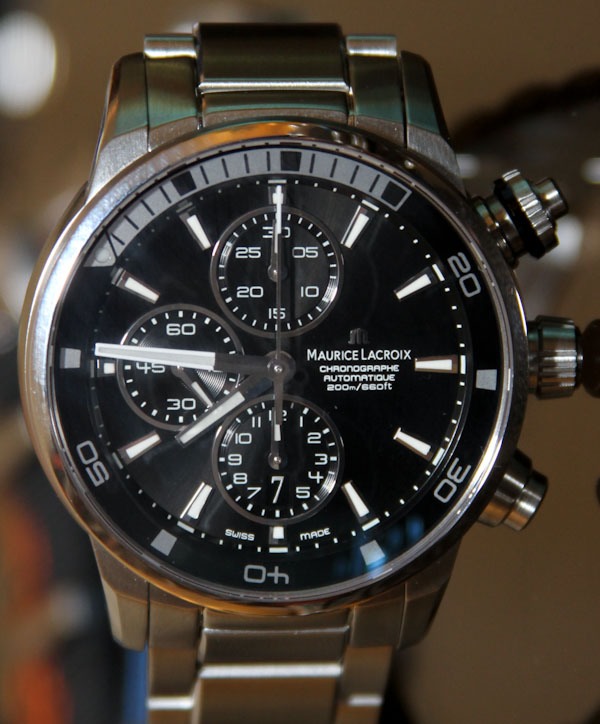
The most impressive new Maurice Lacriox watch this year is easily the Pontos S Diver. I think Maurice Lacriox eventually dropped the "Diver" part of the name. Who knows why - I am still going to call it the "Diver." I first discussed the Pontos S when debuting it to the world here. Now with a hands-on look at the final versions I can once again say "I like it."

It is interesting to understand why I like the Pontos S. There is nothing extremely innovative or fancy about this diver. It is a very unremarkable watch on paper given all the other watches that have the exact same features. What it does have is a clever design which mixes "familiar" with "I haven't seen it done like that before." It has the right mixture of colors for flair, options for choice, and legibility for daily wear. It is normal enough to be welcome to most people, with just enough excitement to fend off boredom. Wow, that is so super Swiss.


Maurice Lacroix offers four versions of the Pontos S diver right off the bat. The highest-end version is the red-accented model which features a different movement. Why make one of the four models with a totally different movement? No idea. It is one of those mysteries that simply makes things interesting. Even Maurice Lacroix's US distributor isn't sure why that is. It is further possible that the red version will be limited in production.

At 43mm wide, with a thinner bezel, the Pontos S is a great size for most wrists. While the dial looks large, it won't sit massively as some fear with pieces 44mm and above. Plus, the case is thick enough to allow it to feel "less than puny." Dial design is downright elegant in its highly contemporary design approach. There is a dash of futurism in the design of the dial and pushers. How will the design age? Hard to say, you'll need to strap it on your wrist for a few months or years to find out.


The trick internal rotating bezel is a technical highlight of piece. Maurice Lacroix designed the inner bezel to be operated by a crown that is integrated with the top chronograph pusher. This eliminates the need for an additional crown - and sorta looks cool. However, the red version of the Pontos S does have an extra pusher on the left side of the case - that is for adjusting the date because it has an ETA Valjoux 7753. The other three models have ETA Valjoux 7750 automatic chronograph movements. The difference is really just the layout, but more and more I am liking the more symmetrical display of the 7753 and 2894 versus the lopsided 7750. Don't get me wrong, I have much love for the stalwart workhorse that is the 7750, but it isn't too often one thinks of it as a sexy beast.

Detailing on the Pontos S is good. You have things like faceting on the bracelet, and the right mixture of polished and brushed surfaces. For an over $4,000 diver without an in-house movement, Maurice Lacroix pushes to give you as much bang for your buck as possible. The affordability (relatively speaking) of the brand is aided by their use of Hong Kong suppliers for a lot of components, mixed of course with Swiss parts. This is the case with many Swiss brands of course. The trick is military like oversight of those suppliers to ensure the stuff they make is good.


It is easy to miss the date window on the dial - but it is there as part of the lower chronograph subdial. See it now? I am enthused by the dial design overall, as well as the feature set of the Pontos S. That little hint of extra modernity sells it for me. As a diver you have a healthy 200 meters of water resistance that will be suitable for all but actual professional dive use. Though you need to choose if you are a red, white, orange, or blue type of person. You no doubt are irritated (well you should be if you aren't) that I didn't picture the pieces with the colorful NATO style straps. I was going to, but the pieces I had available to me were all on bracelets! Though if you've seen one or two NATO style straps, you've sort of seen them all right? Prices for the handsome and slightly edgy (just enough) Maurice Lacroix Pontos S (diver) watches range from $4,100 - $4,600.

martes, 28 de agosto de 2012

Sinn Chronograph Tachymeter Limited Edition Watch


German Sinn timepieces are really hard for us tool watch lovers to resist. Often stalwart in their new products, over the last few years they have been a bit more trendy and playful. While I don't know first hand, I have a feeling that the Bell & Ross success was a major eye-opener for them. Back in the 1990s when Bell & Ross began, they were basically selling dual-branded Sinn watches in a new distribution method. It was basically like selling the best tools in a hardware store, but now in an department store. Bell & Ross has since come a long way, but their roots in offering plain and simple instrument watches hasn't changed much.

I've noticed Sinn starting to offer more limited edition models, especially those that play into the vintage watch theme. Here is one such limited edition model that will surely appeal to Sinn and vintage watch lovers. This is the Chronograph Tachymeter - and is sort of exclusive for the German market (though anyone can get one). The Chronograph Tachymeter revisits the old style "snailed" tachymeter spiral scale and vintage colored lume. All matched to a light brown strap with racing portholes. It is a sort of neat piece that combines a vintage appeal with the traditional Sinn ethos.


Sinn uses an all high-polished steel case that is 41mm wide. It looks great matched with the black rotating diver's style bezel. The chronograph pusher are simple plunger style to add to the vintage feel. Over the dial is a domed acrylic crystal - typical of older sport watches. The case is water resistant to 200 meters. Sinn likes to point out that the dial is done in a matte black tone. You'll notice a picture of white with the "aged" yellow look of the hour markers and lume on the hands. Sinn designers did a good job of creating that iconic spiral scale on the dial, but also not making the dial look too busy. Part of this has to do with the diminutive gray colored subsidiary seconds dial, and well-integrated date window. I really don't think anyone is going to use the tachymeter function, but it looks cool enough.

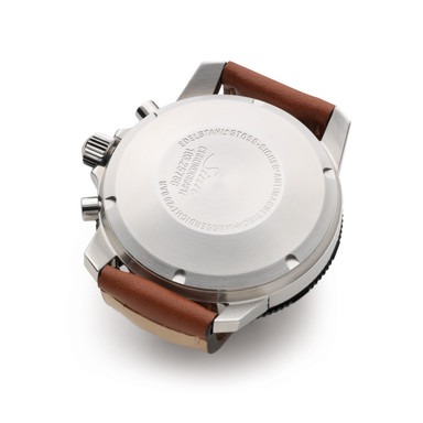
Inside the watch is a modified (some registers removed) Swiss ETA Valjoux 7750 automatic movement. The attached leather strap is something I wouldn't have guessed to see on a Sinn timepiece. Nothing wrong with it, but it isn't the type of style I usually associate with the brand. This is a special product meant to fit into a certain vintage themed. While uncharacteristic for Sinn to do this, it came out quite nicely. Sinn will produce just 100 pieces of the limited edition Chronograph Tachymeter watch. They have done so for a German online and catalog retailer called Manufactum.de (see the Sinn Chronograph Tachymeter watch via them here). Price is 1,350 Euros.


Sinn Chronograph Tachymeter Tech Specifications

Mechanical Movement:
Valjoux 7750
automatic winding
25 jewels
28,800 vibrations per hour
stop seconds
Shockproof according to DIN 8308
Anti-magnetic according to DIN 8309

Housing:
Polished stainless steel case,
Cover glass acrylic
down back
screwed crown
Water-resistant to DIN 8310
Pressure resistant to 20 bar (= 200 m water depth)
To low pressure

Functions:
Hours, minutes, small seconds
date display
stop second
Triple graduated tachymeter scale in spiral form for the reading of average speeds
of 20 km / h to 300 km / h
Pilot's bezel with luminous marker main

Dimensions & Weight:
Case diameter: 41 mm
Lug width: 20 mm
Case thickness of the clock: 15.5 mm
Weight without strap: 74 grams

Dial & Hands:
Matt Black dial
Indexes with luminescent color
Hour, minute, stop second hand with luminescent color

Sales: Obtainable only through Manufactum

Prices from Manufactum: 1.350, - EUR with leather strap, As of August 2012, technical changes


lunes, 27 de agosto de 2012

Omega Seamaster Ploprof 1200M Watch Review


An ad for the original Omega Ploprof stated, "It may not look pretty on the surface, but deep down it's beautiful." It is a curious statement for an official advertisement, but well sums up a lot of what the original early 1970s super diver was all about. Omega was one of the lead innovators along with Rolex in the market to supply serious professional divers (most notably the likes of Jacques Cousteau) with reliable diving watch instruments. In its heyday, the Ploprof (a contraction of "Plongeur Professional") was an extremely advanced tool based on years of development.

Omega achieved a design that not only withstood the depths, but was able to, time and time again, remain underwater for very long periods of time. It sported unique features such as a more or less one-piece case, easy to grip safety bezel, and secure crown. It was arguably the best diving instrument of its time. It was also very expensive. As a professional instrument it actually sat more or less at the top of the Omega product line and was extremely expensive even considering its professional-use market. Nevertheless, the watch was a hit with pros and consumers alike. Yet Omega needed to make excuses for its looks.


History seems to claim that the Ploprof was a hit with the men and a dog with the ladies (not a cute puppy). The design isn't exactly elegant, which has much to do with the fat orange minute hand, and the strange looking asymmetrical case. Today it looks a bit like a Star Wars spacecraft on your wrist. Nevertheless, we find it beautiful. So beautiful that the original models continue to enjoy a very healthy cult status and collector's market. In 2009, Omega released an updated version of the Ploprof under the Seamaster collection, offering fans of the design an exciting modern way of enjoying the famous diver.

Why do we find the Ploprof attractive? That is a good question, and I think it is for the same reasons we find a tank or well-designed tool attractive. The Ploprof was born in a lab, by engineers and technicians. No one sipping an espresso ever sat at a cafe and discussed how the piece would make for a nice luxury item and whether they could put diamonds on it. It was the anti-luxury high-end watch. A real tool that signaled the result of teamwork and problem solving. Something which represented innovation without concern for budget, and was designed to be a necessary element in the exploration of the deep. Tools such as this are created by smart humans to let humans do more than we could without them - and that concept is completely sexy.


The modern Omega Seamaster Ploprof 1200M holds those principles true - at least it emulates them well. No longer is a mechanical dive watch necessary or even used often by professional divers. But if you want to SCUBA dive deep with this watch then it is ready for duty anytime. Side by side with the original Ploprof watch, the modern incarnation is very similar with notable changes and upgrades. In a sense, the new Ploprof is the original Ploprof that Omega always wanted to build.

While the original Ploprof was 54mm wide by 45mm tall, the new one is 55mm wide by 48mm tall. The taller case helps frame the bezel and dial a bit better. There is a lot of steel in the case, and this is no lightweight watch. That weight goes up on the mesh metal bracelet. It does not bother me, but some will find wearing the watch to be a workout. We all need more exercise though. As strange looking as it is, the case is quite comfortable. While the new caseback details a "sea horse" engraving, it does mimic some of the texture of the original Ploprof designed to keep the watch from slipping around. The tall and flat back also makes the case relatively stable. On my medium sized wrists, the Seamaster Ploprof 1200 is remarkably comfortable and well-composed. So much so that it is almost surprising.


Case details are impressive. You can see the polished faceted edges and well integrated parts. The shape of the case quickly grows on you, but it is not without its quirks. The massive case is very solid, and has 1,200 meters of water resistance. This is twice the rated water resistance of the original which had 600 meters of water resistance. Though reports seems to indicate that both the original and new Ploprof can exceed their depth ratings. Probably not a good idea to "try that at home" (do you live underwater?). The case also includes an automatic helium release valve to ensure you can go down that deep without helium popping out the AR coated sapphire crystal.

The two most notable features of the case design are the bezel rotation system and the crown protector. Let's start with the bezel. The bezel itself is tall and sloped, and a thing of beauty. Omega fitted it with a sapphire crystal inlay - which is a major upgrade from the acrylic of the original. These so called "sapphire bezels" are highly valued by myself, but more common these days are ceramic bezels. Omega offers these as well on other Seamaster models in the form of basic ceramic or Liquidmetal bezels. Assuming you have the industrial process down, I believe that ceramic bezels are less expensive than sapphire ones. Each are durable, but the aesthetic are different. The beauty of the sapphire covered bezels are that they visually integrate with the dials more because of the dial crystal. Under the sapphire is a standard minute marker array coated with a lot of luminant. More SuperLumiNova is used on the dial. From a darkness viewing perspective this is a very bright watch - high marks for lume quality and volume.


Unlike most diver's bezels, the one on the Omega Ploprof rotates in both directions. This makes it easier to set. Only the bezel can't be moved unless the vertically aligned pusher on the top right-hand part of the case is depressed. The original models had this piece in plastic, but Omega put a metal one with an orange aluminum ring around the pusher on the 1200M models. At first, having to press down the pusher and rotate the bezel ring with one hand is rather awkward. I worried about what this would be like with diving gloves on. While I never did test it with gloves, the process became simple rather fast, and now I don't mind or think about it at all. I also like to pretend that the pusher is a little antenna. For what? I don't know... let me have my nerdy fantasy.

For years I saw the crown on this watch and had no idea how it worked. Plus, the crown on the 1200M Ploprof is very different than that of the original models. It is meant to protect the large crown, and acts as a sort of plus and minus. On the one hand you can ensure a lot of water resistance and crown protection, but it does make it less comfortable to use. The way it works is that the large guard releases as you unscrew the crown. That is simple enough, though sometimes it can be tough to get enough leverage on the crown if it is screwed in too tight. When the crown is released it then functions normally. However, there isn't a lot of play room to release the crown in the winding, date correcting, or time setting positions. This is just a quirk of the design, and again is a simple balance of features the Ploprof is intended to have.


The Seamaster Ploprof 1200M dial is a significant upgrade over those of the originals in terms of quality. Though it is visually similar. The dial is legible and attractive, with a lot of Omega DNA in the design. I found it easy to read and live with as a stalwart instrumental companion. Omega offers the dial in both black and white. Though the black often resembles a deep blue based on its glossy finish. You have applied hour numerals and the fat orange minute hand is a welcome metallic hand versus merely painted orange. The date window is out of the way, but easy to spot. Overall the dial is simply a more attractive and modern redo of the original. Which itself was based on older Omega dive watch designs.

Inside of each Omega Seamaster Ploprof 1200M watches is an in-house Omega made caliber 8500 automatic Co-Axial Escapement Chronometer movement. The original Ploprof also contained an in-house made Omega movement called the caliber 1002 automatic. The 8500 is a pretty good movement which I've discussed before. It has a power reserve of 60 hours and is one of the first very modern in-house Omega movements. This is their standard three-hand automatic caliber for high-end models. One quirk of the movement is how you set the date. Omega designed the hour hand to be moved independently for travel purposes, but this is also how you adjust the date. By rapidly moving the hour hand back or forth you can move a day ahead or behind. Though this is much slower than simply moving a date disc. This can be annoying when you've left the watch around for a while and need to reset the date. But on the plus side it is easier to travel with.


While you can get the Omega Seamaster Ploprof on a white, orange, or black rubber strap, it is hard to overlook the milanese (mesh) metal "shark-proof" bracelet. While aesthetically this bracelet is not for everyone, this is one of the best bracelets of its type out there. First of all, the metal mesh is made very well and does not have the tendency to pull arm hair. Second, Omega designed it to have actual removable links - which makes adjusting it very simple. Plus, the links are hard to see so it looks like one flush bracelet. Both texture, quality, and feel are very good on this mesh metal bracelet in comparison to others out there.

Then there is the deployant - which is wonderful. The push-button clasp system hides two secrets. First is a diver's extension which smoothly unlocks from the deployant. It is made from solid milled pieces of steel. Then there is the best part which is a ratcheting micro-extension system. A small button labeled "push" on the inside of the deployant lets you adjust the bracelet with what feels like an entire inch of total space in small steps. This offers a secure and comfortable fit (necessary for a heavy watch), as well as the ability to adjust the size for comfort at any time. To top all this off, when you close the clasp on your wrist it looks very compact and is minimally obtrusive. On the deployant are Omega and Seamaster engravings which are filled with probably black lacquer for extra visual pop.

Even after a few years on the market, the Seamaster Ploprof 1200M is a strong seller, but it isn't cheap. Then again, it wasn't cheap back in the early 1970s either. Has the design become more sexy over the years? Even by female standards? I can't speak for women, but I think it certainly has gained a degree of honorary elegance given what it is. No one I presented the watch to thought it was unattractive. As I discussed above, I think anyone can appreciate its tool watch spirit, as well as find great and sincere beauty in that fact. As an instrument, it works rather flawlessly. Retail price for the Omega Seamaster Ploprof 1200M watch is $9,400 on the strap and $9,700 on the bracelet (as seen ref. 224.30.55.21.01.001).

domingo, 26 de agosto de 2012

Jaeger-LeCoultre Master Ultra Thin Réserve de Marche Watch


For class and confidence it is hard to beat a Jaeger-LeCoultre Master collection timepiece. When I say this I mean two things. First of all, these are formal timepieces meant for fancy occasions and suits. A smart person could pull it off casually, but this is an elegant creation before it is a sport watch for sure. Second, the design, movement, and overall pedigree elicits a sense of confidence. Jaeger-LeCoultre not only makes their own movements, but also makes their own cases. They do so very well, and the competency of a watch like this is something watch lovers can recognize. It is a timepiece that just feels very comfortable in its own skin.

This particular Jaeger-LeCoultre Master is the 2012 Ultra Thin Reserve de Marche, an update on a watch with the same movement from a few years ago. The updated model is larger and has a more attractive dial. It also has the name "ultra thin" attached to it. A lot of brands are applying this term on even existing watch cases because thin mechanical watches are trendy. Pure marketing as far as I can tell because while these watches are more thin than sport timepieces, they aren't any more thin than they would be without the added terms. Honestly, unless a timepiece is wafer thin does the rather ultimate word "ultra" need to be used? A term like that should be used when the consciousness is about to be shocked.


The model this watch builds on is the Jaeger-LeCoultre Master Reserve de Marche that was 37mm wide. JLC thankfully pumped up the case size to 39mm wide. Still pretty small, but a lot better than 37mm. With a thin bezel and less than shy lugs, the piece doesn't look as small as it is on the wrist. From a naming perspective, the new model just has that "Ultra Thin" part added to the name. This year, Jaeger-LeCoultre will offer it in steel or 18k rose gold on an alligator strap.

The dial has been cleaned up and looks a lot better than the previous version. JLC uses all applied triangle style hour markers and uses properly sized dauphine hands with that great finishing that has one side being satinized, and one side being polished. As the dial is a bit larger, the subdials thankfully don't intrude as much on the hour markers making for a cleaner, more legible look. The non-main hands are in blued steel - which adds a welcome color hint to the face as well. Though in essence, the dial is very much a carry over from the original watch from a few years ago - which isn't a bad thing. This is an asymmetrical - though relatively balanced dial.


Inside the watch is the same Jaeger-LeCoultre automatic caliber 938 in-house made movement. Functions include the time with subsidiary seconds dial, date dial, and power reserve indicator. The movement has a power reserve of 43 hours and is comprised of 273 parts. Typical of the brand, Jaeger-LeCoultre finely decorates the movement, which is visible through the sapphire caseback window. The Master Ultra Thin Reserve de Marche is a fantastic piece for what it is. Comfortable and stylish, it is really a classy piece with a long-term appeal and just the right mixture of simplicity and complication. The only thing I would like to see is what it looked like with a strap that was fitted right to the edge of the case versus leaving a gap.

sábado, 25 de agosto de 2012

Jaeger-LeCoultre Reverso Watch for Singapore’s Raffles Hotel


Of all of the world's many thousands of hotels, very few ever become an icon for the city or country in which they are based. Consider Haiti's Hotel Oloffson, Dubai's Burj Khalifa (as seen in MI4: Ghost Protocol) or the Bellagio Hotel of Las Vegas. These are hotels that have become international set pieces and back drops that make up part of the visual mindscape that many people have for locations that they may have never visited. Some hotels are so longstanding that they can become a pillar for global tourism in their area. Singapore's premiere example of this is the Raffles Hotel, which will soon be celebrating its 125th anniversary and will mark the occasion with a series of specially engraved Jaeger-LeCoultre Reverso watches.


The Reverso has been around for over 80 years and is an excellent choice as the symbol to commemorate the 125th year of the world famous Raffles Hotel. Established in 1887 and named after Singapore's founder, Sir Stamford Raffles, the Raffles Hotel has weathered the winds of change and has done so quite admirably. Declared a national monument in 1987, the Raffles Hotel has been host to Queen Elizabeth and Prince Phillip, played set piece for Glen Close in 1997's "Paradise Road", and has won literally countless awards during its considerable lifespan.


Jaeger-LeCoultre needs little introduction as one of the world's leading luxury watch brands and it's not hard to see why one of the world's best hotels would want to draw connections between their legacies. In this case, the connection is actually fairly superficial with interested buyers being able to choose between two models of the Reverso which have had the back panel of their reversible case engraved to show “Raffles Hotel 1887-2012 Singapore”. The two models are the Reverso Grande Taille (ref 2708410), and the ladies’ Grande Reverso Lady Ultra Thin (ref 3208421). The gents' model is powered by the hand-wound caliber 822 movement while the ladies' model features the quartz caliber 657. The Reverso is an excellent example of the difference between fashion and style. A simple Reverso has no consideration of trends, instead it is a product of design and style which successfully operates outside much of the ebb and flow of fashion.


For their 117th anniversary, Raffles sourced 117 customized Longines watches and we think they have chosen well for their 125th, not only with JLC, but specifically with the Reverso. For a hotel to survive 125 years of recent human history, it has to be able to change and grow without loosing its soul and the joie de vivre which makes it unique. While the engraving is not the most novel nor creative of designs, it does make a simple connection between the life of the hotel and the legacy of the Reverso. While decades of human history would suggest that even good things often come to an end, we still have the Raffles Hotel and we still have watches like the Reverso.

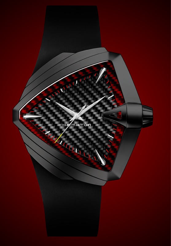
Watch What-If: Hamilton Ventura XXL


"Watch What-If" is a special column on aBlogtoRead.com that asks the playful question "what if an iconic watch you know and love was offered in a different style?" The idea embraces a good timepiece's core design and has fun by offering new colors and material concepts to stimulate your senses. These ideas may be provocative, artistic, or just plain silly. This is about fun, Photoshop, and the celebration of wrist watch design and experimentation. The original design we work off of will always be at the bottom of the article. The designs are brought to life by Beau Hudspeth who does the artwork and concepting after he and I choose the models and styles to focus on. These "special design experiments" are extremely time consuming and labor intensive but we hope you enjoy the results. Ideas and comments are more than welcome. Enough response may even lead to a round two of design of the same watch - so please comment below. You are also encouraged to suggest the watches that should make it into the Watch What-If section here on aBlogtoRead.com.

Watch What-Iffed: Hamilton Ventura XXL


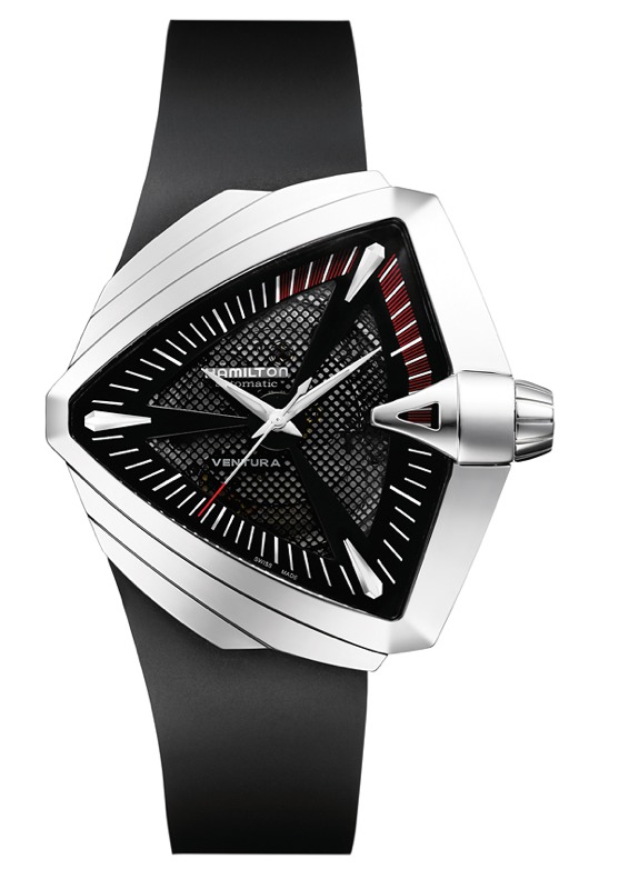
The original:


viernes, 24 de agosto de 2012

Porsche Design P’6540 Heritage Chronograph Watch


Porsche Design completes what I believe is a trilogy of "Heritage" watches celebrating the brand's history by recreating in a modern skin some of the brand's most iconic pieces. For 2012 it is the P'6540 that gets a new limited edition piece. Previous years saw the limited edition Porsche Design P'6520 and P'6530 watches. The P'6540 Heritage Chronograph evokes a design that originally came out 40 years ago. This is almost surprising given how modern the watch looked even then. The piece it references was called the Chronograph 1, and was the very first Porsche Design watch that coincided with brand's launch in 1972.

From the clean dial to the lugless case, everything about the piece was modern. It was also one of the very first watches to have a black coated metal case I believe. Though back then, the metal coating was not exactly as great as it is today, and was said to have a tendency to wear off. The Heritage versions of the classic pieces are not direct analogs. They are larger and constructed using modern materials and techniques.


At Baselworld 2012 I got to check out an early version of the new P'6540 Heritage Chronograph. You'll note that Porsche Design made a lot of dial changes between the prototype and the final version shown in the marketing photographs I have included. While the prototype I checked out is more like the original, I think the final version is the best looking. The original Chronograph 1 used a Lemania chronograph movement and not the ETA Valjoux 7750 used in the modern version. This required a slightly different design for the prototype model, but it lacked a bit of sexiness. The final version cleans up the dial and makes it a lot more elegant, in addition to adding some "nice watch" elements.

You'll notice that Porsche Design recessed the subsidiary dials a bit and added applied hour markers. They also minimalized the markers in the subsidiary seconds dial and added red chronograph hands. All this changes the look of the dial sure, but honestly makes for a nicer watch in 2012. The original feels a lot like a tool watch and isn't complete looking without the Lemania movement in a modern rendition. Thus, some updates needed to be made. Last, Porsche Design added a "40Y" label on the dial indicating that this is a 40th anniversary model.


The P'6540 Heritage Chronograph (ref. 6540.10.41.0271) watch is 40.5mm wide in a bead-blasted titanium case with a blackish PVD coating. Not sure if the final version will be deep black or dark gray. AR coated sapphire crystal is over the dial and there is 100 meters of water resistance. The bracelet will be matching titanium, and is a modern take on the original. The links are a bit thicker on the modern bracelet, but it certainly carries the tone of the original from the 1970s. Like I said, inside the watch is a Swiss ETA Valjoux 7750 automatic chronograph movement with a special Porsche Design rotor.


The P'6540 Heritage Chronograph will be limited to 911 pieces and is overall a pretty cool watch. It is still very masculine, and the "function and form" design philosophy of the original makes more sense than ever today. Porsche Design has created a special collector's box set for the watch that includes a pair of P'8478 aviator sunglasses also based on the design of Porsche Design sunglasses from the 1970s. Pretty cool stuff. Price is $7,440.

jueves, 23 de agosto de 2012

Vacheron Constantin Quai de l’Ile Retrograde Annual Calendar Wath


One of my earliest "controversial" articles that made the watch industry raise its brow was on the first release of the Vacheron Constantin Quai de l'Ile watch collection from back in 2008. I more or less panned the concept and execution of the watch. But did so in a way that allowed even Vacheron Constantin to appreciate and respect my feedback. Last year I was told in confidence by them that the Qaui de l'Ile (QDI) was going to be redesigned, and I felt a moment of pride that my opinions are valuable to at least a few people.

The original QDI suffered (in my opinion) on a few fronts. First was the eye straining design that make it hard to read. Second was the "passport" protections of the dial, and third was the fallacy of "customization." You can read all about my thoughts in the previous article. Now, slated for release in 2011, Vacheron Constantin will release a new version of the QDI. I still can't pronounce the name of the watch to save my life, but I like it a lot better. Retained is the case design which I quite liked, and new is an updated movement and much easier to read dial.


Aside from the Overseas, VC (Vacheron Constantin) has more or less no watches for casual wear, sport situations, or anything that isn't super classy or super complicated. So the QDI was sort of meant to be it. VC wanted (still wants) to have offerings that appeal to younger watch buyers. While the brand is doing really well with their core collection pieces, not sure how well that "age push downward" has been going. Don't get my wrong, there are a lot of VC watches I like, but I would never think to wear one while wearing shorts and drinking a beer.


The new QDI watch is called the Vacheron Constantin Quai de l’Ile Retrograde Annual Calendar. As such, you'll note that it has an annual calendar with a retrograde date hand. The movement is new, but not radical in its difference from the calendar movement from the old QDI. Basically VC just made a few changes, adding the moon phase complication, removing the power reserve indicator, and maybe a few other things. The movement is the beautifully in-house made Calibre 2460 QRA automatic movement. It has a Seal of Geneva on it and a pretty black/gray ruthenium plated 22k gold rotor. The moon phase indicator needs adjustment once each 122 years (assuming the watch is running all the time), and the calendar needs to be adjusted only once a year. The difference between an annual and perpetual calendar are only slight, and annual ones are much less expensive.

The dial is very simple compared to what the watch used to have. It has a simple and straight forward look that is pleasant. It isn't going to win any awards in terms of creativity, but it is something I would gladly wear. The dial has some pleasing vertical texturing as well. I do like the large applied gold hour makers and hands (even though the hands are still arguably too simple).


While the passport and strange dial are gone, the "customization" is still there. Vacheron Constantin is careful this time around to point at that customization means choosing from a few predefined options. I guess over the last few years watch brands have realized that people are actually reading the press releases that barely put any effort into, and are in turn scrutinizing them. As such, the new QDI seven part watch case can be constructed from a few metals, and I believe you can also selectively choose the finishing (polished, brushed, etc...) on the various case parts. According the VC the case has 700 possible combos to choose from.

Even though the new QDI is a toned-down version of the original one, it does feel more like a Vacheron Constantin. To be honest, VC didn't really that much to change the watch - it is more like a project refresh. The piece now has a classic feel to it, and the case still looks great after two years. This is the QDI that should have come out in 2008, but it will be here for 2011. Glad Vacheron Constantin heeded the advice I, and I am sure other people, gave them. The Vacheron Constantin Quai de l’Ile Retrograde Annual Calendar watch will show up for sale sometime in 2011 and be officially unveiled in January.

Bell & Ross BR01-92 Gold Ingot Limited Edition Watch


Short post, but here the images say it all. If there was ever a gaudy watch that I wanted, it would be this watch. I typically shy away from euphemistically decadent watches such as this, but I am oddly drawn to the golden hues and texturing of this special limited edition watch from Bell & Ross. Take the extremely popular Bell & Ross BR01 series, make it out of gold, and make it after gold bars, and you have the Bell & Ross BR01-92 Gold Ingot. It is not just another gold watch, but a commentary on luxury itself. The entire 46mm wide case is constructed in 18k rose gold, and so are the hands, dial, and hour markers.

Special pyramid texturing on the dial really makes the watch special. Just a gold watch would be one thing, but this is a watch with a gold personality, and that is not just me sounding cheesy. It retains everything you like about the Bell & Ross instrument look and appeal. I like how the gold hands are skeletonized so that you can see the gold underneath. The numerals are gold on gold, for that golden look. Gold screws stand in for the typical steel, actually I don't need to mention all this, you get the point - GOLD!


Inside is the same Swiss ETA 2892A2 automatic mechanical movement powering the watch, while the shiny black alligator strap works well. I think a brown strap would look even a bit nicer against the rose gold, don't you think? The Bell & Ross BR01-92 Gold Ingot Limited Edition watch is available in select place to select people. This is the gold watch to own for people who would not otherwise shell out for a gold watch but suddenly must do so. There you have it, don't make me yell "gold" again.

Romain Jerome PAC-MAN Watches


Romain Jerome's relationship with classic video games continues with their newest watch in honor of PAC-MAN. Namco's (today Namco Bandai) PAC-MAN arcade game is probably one of the most recognizable video games in history and originally came out in 1980. Following the success of the Space Invaders watch (hands-on here), Romain Jerome will soon release this high-end limited edition timepiece for those who remember their joystick youth.

PAC-MAN has probably been the subject of less expensive watches, but this is the first time the popular yellow glutton is featured on a luxury product. Based on the RJ Moon Invaders watch collection, the PAC-MAN watches recreate a view of the game play complete with high-quality rendered pixelated characters. Romain Jerome uses a very sophisticated dial production process which layers material to be crisp and offer a true three-dimensional view.


Collectors can opt for one of four versions of the new PAC-MAN watch. In each, PAC-MAN is situated at 9 o'clock on top of a 3D depiction of the game play maze. The yellow color is applied with a special glossy lacquer. The ghost enemies are available in gray or colors, each with eyes looking at PAC-MAN. The other two models mimic these but contain two pairs of the iconic extra point cherries. An official PAC-MAN logo is located over 6 o'clock. The tips of the watch hands and character are applied with SuperLumiNova luminant. While PAC-MAN is static, I think it would have been fun to have him function as the subsidiary seconds hand and spin around.

The watch case itself is in steel and 46mm wide. The case is PVD black coated with polished and sandblasted surfaces. Being part of the Moon Invader watch collection, the case has some trace materials from the Apollo 11 moon lander. Attached to the case is a black rubber strap.


Inside the watches are Swiss automatic Concepto movements. These are most certainly unique pieces for a highly exclusive pool of collectors. Are you one of them? You'll have to have been very into video game history or very wealthy. It helps if you are both. Personally I prefer the PAC-MAN watches to the RJ Space Invader pieces. I think the dials are more interesting and the character rich eyes of the ghosts bring a friendly quality to the piece. Further, PAC-MAN as a character is just as popular as the memorable game play. I have seen them hands-on and they are quite cool on the wrist. The presentation box will surprise you.

Romain Jerome will produce a select batch of the PAC-MAN timepieces as a limited run of just 20 pieces per each of the four styles. The watches will be exclusively launched at the Colette store in Paris on September 3rd, and then at other Romain Jerome retailers thereafter on September 10th, 2012. Price for the Romain Jerome PAC-MAN watches is $17,900.

miércoles, 22 de agosto de 2012

Linde Werdelin Oktopus II Double Date Titanium Blue Dive Watch


Linde Werdelin likes to call themselves a watch lab. The notion suggests an image of scientists sitting around in a white room dreaming up the next cool timepiece. Is this sexy sounding concept true? Yes actually, but Linde Werdelin is not alone in their experimentation. Most small brands have lab style product development processes which eventually lead to final products. How does it work and why is it a good idea?


I appreciate that Linde Werdelin has decided it makes sense to explicitly state what many brands don't discuss - that they take peer review into strict consideration when finalizing their watches. It has been more or less promised to myself and other watch writers that whatever we view at watch shows such as Baselworld are unfinished prototypes. Brands like Linde Werdelin produce close to reality experimental designs that they share with reviewers and retailers before pieces are produced for sale. Suggestions and feedback go into the final products - which is exactly what happened with their Oktopus II Double Date Dive watch.


This peer review production process is actually harder than simply conceiving a watch and then having it made. Watch production for small boutique brands is a laborious and highly time consuming process. Brands like Linde Werdelin rely on a range of suppliers that produce the many small parts which go into their watches. Working with suppliers takes a long time to get deliveries, and the process can be frustrating for brands. Going back and forth to get pieces 'just right' is an appreciated ordeal that they go through.


Watch design experimentation is also complicated because it can be difficult to know what advice to use and which to discard. You can't please everyone, and it takes a clever team to properly sort out the most useful advice. The Oktopus II for example ended up being more legible and having a more beautiful face. The collection also gets this sexy blue accented titanium model. You can see my original post on the Linde Werdelin Oktopus II Double Date watch here to examine some of the small changes. The updated final design is tweaked with an emphasis on boldness and detail polishing. I still very much like the black ceramic bezel on the 44mm wide titanium case (that is water resistant to 300 meters). This blue accented model will sit next to the yellow accented model very nicely.


What are some of the precise differences from the prototype to this final version? Here are some words from them on the matter:

"The titanium case body has undergone a rougher polish to achieve a more masculine finish. The ceramic bezel has been widened around the fixing screws allowing a stronger hint of colour display from the eight coloured tension disks. The bezel has been given a satin finish with a polished facet on the outer side creating a more luxurious and interesting contrast under the light. The 3 o’clock unit has been opened up with a curve on top to add elegance yet enable easy access to the crown.

The Double Date complication has been visually amplified by opening further the construction of the two independent date wheels. The upper dial has been finalised with a circular satin finish to create an extra visual dimension with subtle gleams under the light."

Linde Werdelin Oktopus II watches should be available soon via their retailers. The entire process from start to finish is fascinating for me to view and I appreciate how the brand makes a concerted effort to share it all with their fans. As well as their octopus wrangling. Prices for the Oktopus II Double Date Dive watch will range from 8,800 - 18,500 Swiss Francs.


Tech specs from Linde Werdelin:

Name: Oktopus II — Double Date
Models: Oktopus II — Double Date in titanium and ceramic with blue accents in the dial — 88 pieces
Oktopus II — Double Date in titanium, titanium DLC and ceramic with yellow accents in the dial — 88 pieces
Oktopus II — Double Date rose gold and titanium with rose gold accents in the dial — 88 pieces
Case: 5 part case-construction / 2.5 mm sapphire crystal antireflective on one side / Screw in back case with engraved octopus drawing / Screw in crown with engraved octopus symbol
Dimensions: 44mm (w) by 46mm (l) by 15,25mm (h)
Dial: 2 layer dial / upper layer laser-cut in stencil technique / lower dial circular Côtes de Genève / date dial at 12 o’clock / date wheel laser-cut layer / hands in stainless steel with satin finish / LW cool grey 1U bespoke superluminova
Movement: Linde Werdelin modified Dubois Depraz caliber 14580 / automatic / double date at 12 o’clock / 40 to 44 hour power reserve / 26 jewels / 28,800 bph (4 Hz)
Water Water Resistance: 300m
Strap: Bespoke high-end rubber strap, interchangeable within Linde Werdelin’s proprietary strap system.